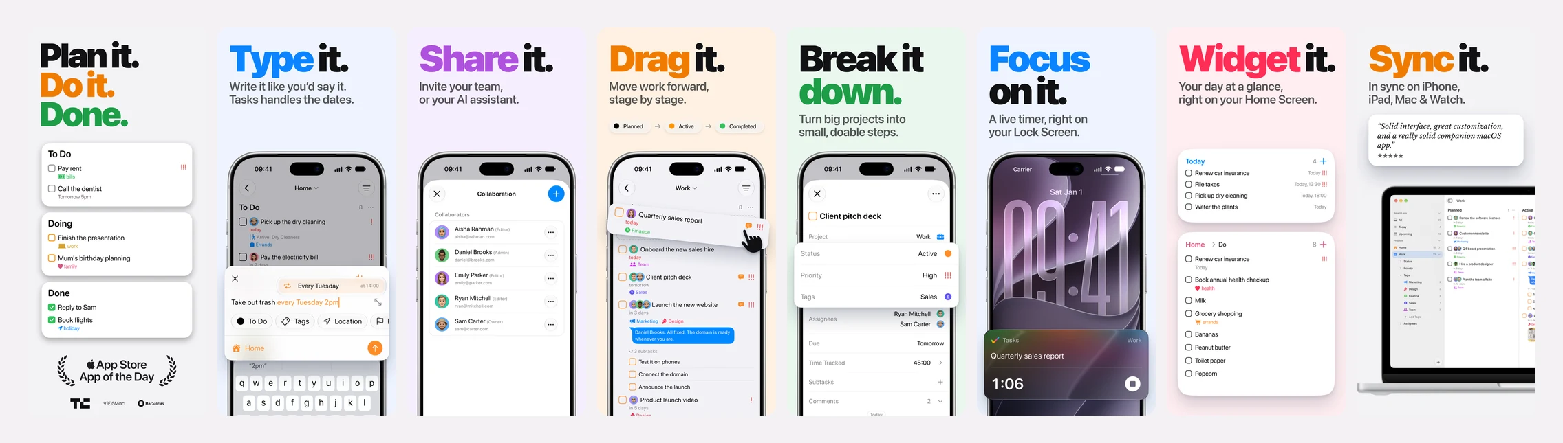
For most people, the App Store screenshots are the first thing they see of Tasks, and often the only thing they see before deciding. Ours had fallen behind the app, so we made new ones for iPhone, iPad and Mac, in every language Tasks speaks.
Every screen in them is a real capture of the app, running real data. Every person in them has a name, a face and a home town that fit the language you’re reading. This post covers how we built them: the data, the people, the design, the scripts that capture it all again whenever the app changes, and the headers that sit above them.
The short version
| What | How many |
|---|---|
| Languages | 18, shown in 23 App Store storefronts |
| People | 8 per language, 144 faces in all |
| Raw captures | 162 iPhone, 108 iPad and 126 Mac screens |
| Time to capture every iPhone screen again | About 9 minutes |
| Screenshots uploaded | Nearly 1,400 across iPhone, iPad and Mac |
| Headers | 3 designs: one image, 18 looping videos and 18 images |
Start with the data, not the pixels
The usual way to make screenshots is to set up an account by hand, take the pictures, then fix the details in a design tool. That falls apart in 18 languages, and again the next time the app changes.
So the data is code. A special Demo build of Tasks erases itself and fills in the same two projects every time it launches. It loads them through the same path as an imported .tasks file, so they behave exactly like real projects: statuses complete tasks, assignees have avatars, location reminders have places. Dates are counted from today, so “due tomorrow” is always tomorrow. Every record’s ID is worked out from its name, so a link to the Client pitch deck task opens the same task in every language and on every run.
Our first try was a project called “Aurora Launch” with a Smart List called “Bugs”. Neither means anything to someone scrolling the App Store. So we started again with two projects everyone already has:
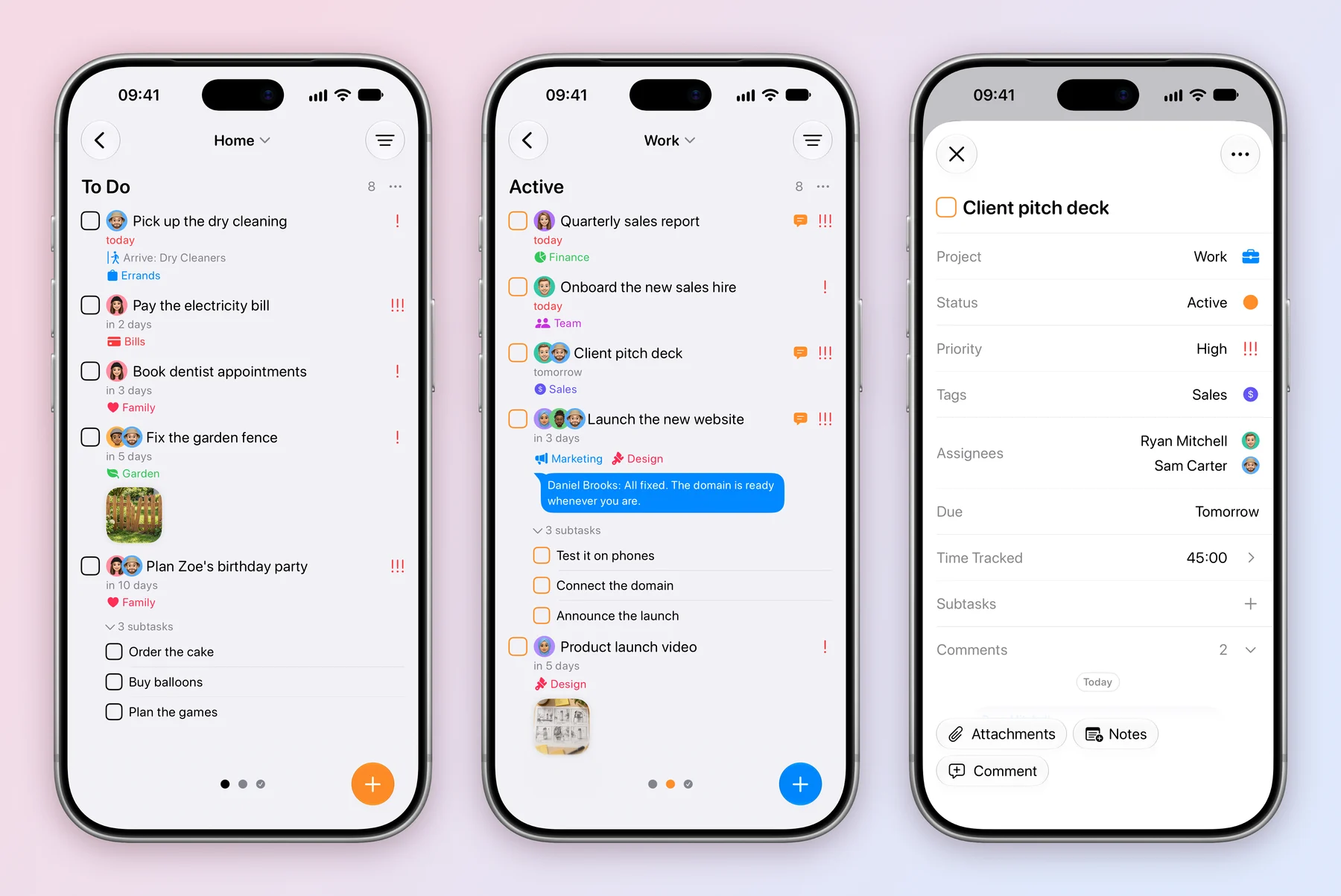
- Home: a family of four sharing chores, bills, a birthday party and the weekly groceries. Its columns are To Do, Doing and Done.
- Work: a team of five launching a website, preparing a pitch and closing the quarter. Its columns are Planned, Active and Completed.
Then came the rules, each learned from a screenshot that looked slightly off:
- Every column is full. At least four tasks each, including finished work in the last column, so no screen ever shows an empty board.
- Colour means one thing. Every priority is red, and the first status is plain black and white, so colour is left for tags and people.
- The top task matters. A board whose first task had no priority and whose second was urgent looked broken, so we reordered it.
- Time and conversation look lived in. Work tasks have real tracked time, and comment threads read like people talking. Exactly one comment is unread, “All fixed. The domain is ready whenever you are.”, so the blue bubble shows up once, where it means something.
- The chores are shared. Dad picks up the dry cleaning and does the groceries, Mum pays the bills, the kids water the plants and call Grandma. We checked that the family’s list didn’t quietly hand everything to one person.
A family and a team in every language
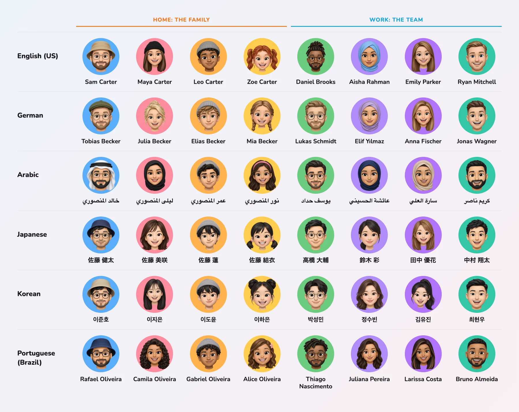
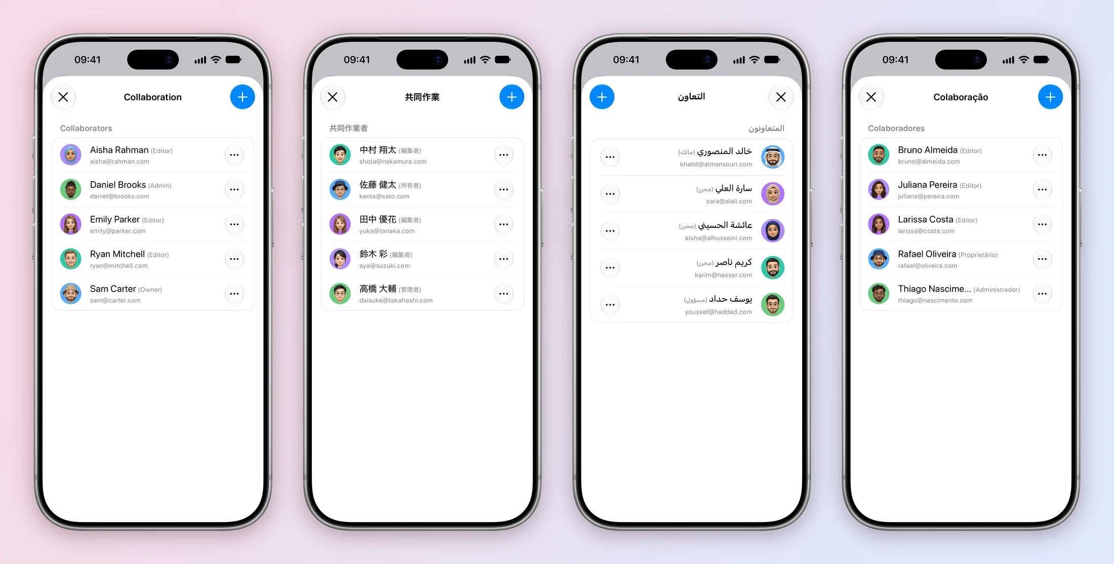
Translating the words was the easy part. A German reader seeing Sam Carter pick up dry cleaning on Sutter Street in San Francisco knows straight away that the screenshot wasn’t made for them. So every language gets its own people and its own city:
| Language | The family | Lives in |
|---|---|---|
| English (US) | Sam, Maya, Leo and Zoe Carter | San Francisco |
| English (UK) | Tom, Hannah, Kai and Isla Walker | London |
| German | Tobias, Julia, Elias and Mia Becker | Berlin |
| Japanese | Kenta, Misaki, Ren and Yui Sato | Tokyo |
| Arabic | Khalid, Layla, Omar and Noor Al Mansouri | Dubai |
| Portuguese (Brazil) | Rafael, Camila, Gabriel and Alice Oliveira | São Paulo |
…and twelve more. The location reminders move with them: in Dutch, the dry cleaning is on Kinkerstraat in Amsterdam, and in British English the grocery run is on Camden High Street. Everyone has an email in the form first@last.com, like kenta@sato.com, which is made up and never sent to.
Each cast is mostly local to its language, sometimes with one colleague from a community that’s common there, such as Elif Yılmaz on the German team or Fatima El Amrani on the Dutch one. Our first draft went further and made every cast as varied as possible. Next to each other, the casts stopped looking like a family in Berlin or a team in Seoul and started looking like stock photography, so we pulled it back. The point is for the reader to see their own street.
144 faces
Our first avatars mixed real photos with illustrations, and the mix looked wrong. We went with one style for everyone: Memoji-like 3D heads, the look iPhone owners already use for themselves.
Every face started as a written prompt, one per person per language, 144 in all. Each prompt describes someone who fits that name and role, like “a white American man about 40 with short brown hair under a tan bucket hat, a full short brown beard and thin metal-frame glasses, the father of the family”, followed by the same paragraph on style, framing and lighting, so the set looks like it came from one hand. The prompts are kept in the repository next to the images, so a face can be generated again exactly.
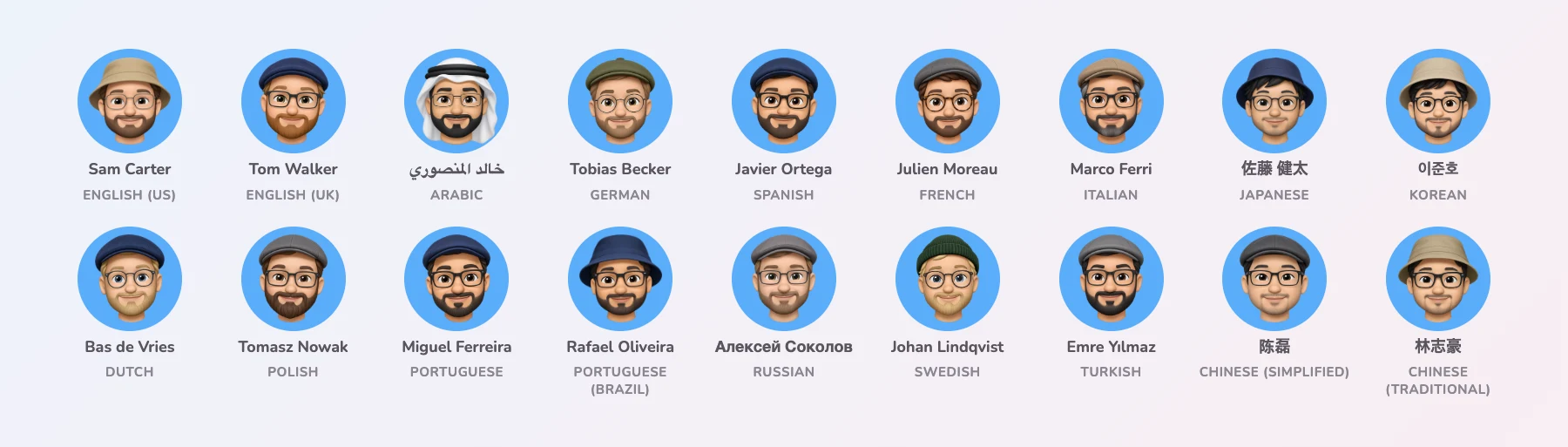
A few looks stay the same in every language, so the cast is recognisable from one storefront to the next:
- The father always has a beard, glasses and a hat.
- The son always wears a light-grey beanie.
- The first colleague always has round glasses.
The small things matter here too:
- Backgrounds. The faces are cut out with a transparent background. The app draws each one on that person’s own colour, so a cut-out Memoji and a square illustration look like one set. Each prompt names the same colour, in case a generator can’t do transparency.
- Trimming. Each PNG is trimmed to its visible pixels, so faces fill the circle instead of floating in it.
- File names. The American colleagues were first called Priya and Marcus. When the cast was reworked they became Emily Parker and Ryan Mitchell, but their files kept their old names. Renaming the files would have changed every record ID worked out from them, and with it every link the screenshot tests open. So
people/en/priya.pngis Emily Parker, and a comment in the code says so.
Words that work in every language
The demo data has 91 phrases, from task titles to comments, each translated into all 18 languages. A small script checks that no language is missing a phrase, a person or a place. Translating them was where most of the surprises turned up:
- “Planned” clashed with “Upcoming”. In German, Dutch and Polish, the obvious word for the Work board’s first column read almost the same as the app’s own Upcoming Smart List. It became Eingeplant, Ingepland and W planach.
- Words that are only local. The first Brazilian draft bought bexigas for the birthday party, which is what São Paulo calls balloons. Elsewhere in Brazil they’re balões, so that’s what the family buys.
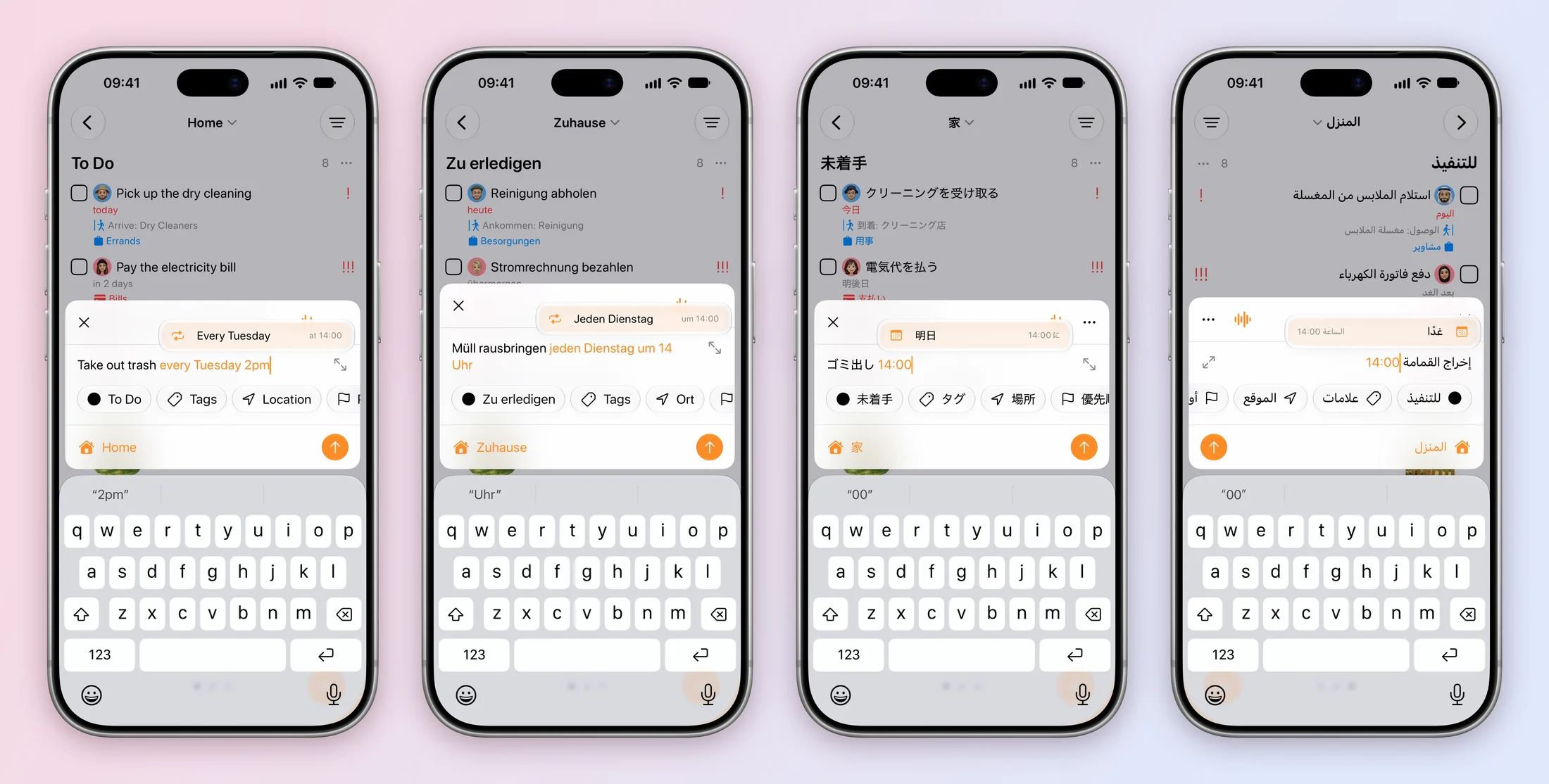
- The quick-add slide only shows what Tasks understands. Tasks reads dates and repeats as you type in English, French, German and Spanish. So those slides say “Take out trash every Tuesday 2pm”, “Müll rausbringen jeden Dienstag um 14 Uhr” and so on, and the app highlights it as it would for you. In the other 14 languages it understands a time, so the slide shows the chore and 14:00, like “ゴミ出し 14:00”. A screenshot shouldn’t show anything the app won’t do for you.
- Arabic reads right to left, and so do its screenshots. The board, the order of its columns, the swipes between them and even the tail on a comment bubble are mirrored. The comment tail was one of a few small things these screenshots turned up, and the fixes went into the app for everyone.
One verb per slide
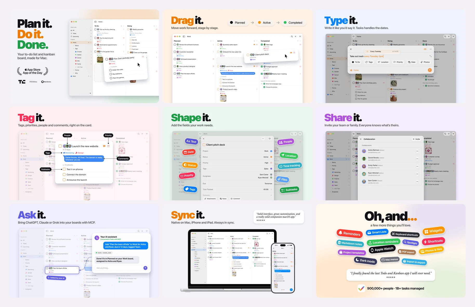
The design lives in one Figma file. Before the final set, we explored ten directions, from a board unfolded across an iPhone Duo to slides built from customer reviews. Our first pass was honestly basic, and the second was too busy: cards scattered at angles looked chaotic, not organized. What survived is the simplest idea, a verb on every slide:
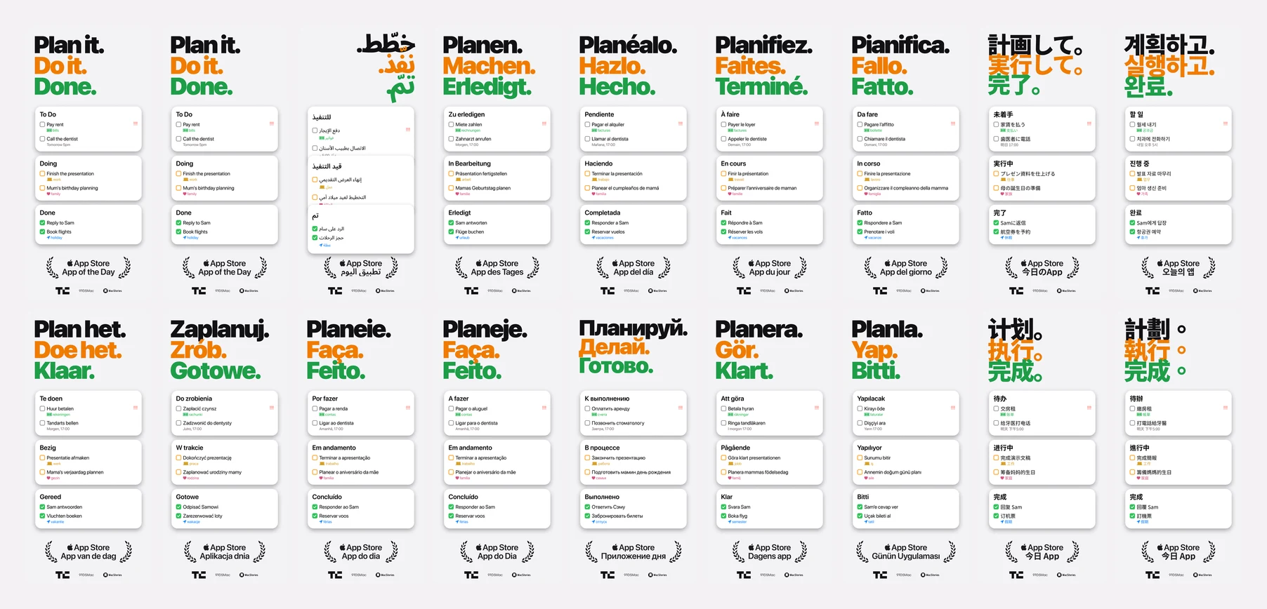
Plan it. Do it. Done. · Type it. · Share it. · Drag it. · Break it down. · Focus on it. · Widget it. · Sync it.
The rules behind it:
- The phone is as big as it can be. Every slide is 1206 × 2622 pixels, and every iPhone is 1110 pixels wide at the same height. The phone sits still and only the story moves as you swipe.
- Two lines, broken on purpose. Headlines are SF Pro Black, with one word in the slide’s colour. Subtitles are always two lines, broken where you’d pause reading them aloud: Write it like you’d say it. / Tasks handles the dates.
- Real parts only. Device frames are the silver iPhone 18 Pro, iPad Pro and MacBook Neo, and every icon is a real SF Symbol. The cards on the first slide are drawn the way the app draws them; a version where a subtask checkbox didn’t match the app was redone.
- Every slide says something new. An early version spent three slides on the board. Each slide now shows a different part of Tasks.
The slides are translated too, keeping a highlighted word in each language. Longer headlines shrink to fit the same width, and Japanese, Korean, Chinese and Arabic use type made for their scripts.
A few details on these slides:
- The award stands alone. Tasks was the App Store’s App of the Day, so the first slide says so in one lockup: the Apple logo, App Store, App of the Day. There’s no year, because the year doesn’t help anyone decide. Translations change the lockup’s width, which pushed it as much as 64 pixels off centre, so it’s centred on its own measured width in each language.
- No star rating. The App Store shows the rating right above the screenshots, and a number baked into an image could soon be out of date.
- Only real reviews. The last slide quotes a real five-star review, word for word. Each language uses a review written in that language. Where no review in that language existed, the card is left off rather than translated, because a translated review isn’t a review.
- The Lock Screen was taken by hand. The Focus on it. slide shows a live timer on the Lock Screen. The simulator shows it too unreliably for a script, so each language was captured by hand with the whole simulator switched to that language, so the date above the clock is in that language too.
Capturing it again in nine minutes
Nobody takes these screenshots by hand. A UI test drives the Demo build through every screen, in every language:
- One launch per language. The app opens once and moves between screens with its own links, which is much quicker than relaunching for every shot. A link to a task opens that task, and a link to quick add fills in the text as though it was typed, with no keyboard or clipboard involved.
- Tap, don’t swipe. The board moves between columns by tapping its page dots, because a swipe would catch a task’s own swipe actions.
- Wait for the element, not the clock. Each step waits for the exact element it needs, and the usual XCTest idle waits are turned off. A screen that fails is retried once, and the attempt is logged with a picture, so one bad screen can’t spoil a whole language.
- Two simulators side by side. The script clones the screenshot simulator and gives each copy half the languages. Six copies overloaded the Mac, so two it is. The status bar always reads 9:41 with full bars and a full battery, as in Apple’s own screenshots.
The first full run took 162 iPhone screens in 12 and a half minutes. The tuned version does it in about nine, roughly 85 seconds a language. The iPad set (108 screens) takes about 21 minutes. On the Mac, the app opens all 18 languages as windows at a fixed 1280 × 800 and captures each one.
Shipping 23 storefronts
Tasks speaks 18 languages, but the App Store has more storefronts than that. Five reuse a language’s set, so French (Canada) shows the French screenshots and Spanish (Mexico) the Spanish ones, and every storefront gets screenshots in a language its readers use.
We designed three complete iPhone and iPad stories, not one: Plan it. Do it. Done., one that opens with proof, and one that starts from the feeling of too much in your head. They’re set up to run against each other with the App Store’s product page optimization, so customers can show us which one works best.
Everything went up to App Store Connect from the command line, flattened first, because App Store Connect rejects images with transparency. All told, that’s nearly 1,400 screenshots, and every one can be made again from code and a design file.
A header for each story
The App Store on iOS 27 can show a wide header across the top of an app’s page, above the screenshots. Each of the three stories got its own, at 3840 × 1646 pixels.
Headers have stricter rules than screenshots. Awards like App of the Day and Apps We Love, and claims nobody can check, aren’t allowed, so the award and the 900,000 people stay in the screenshots. A header has to make its point with the app alone.
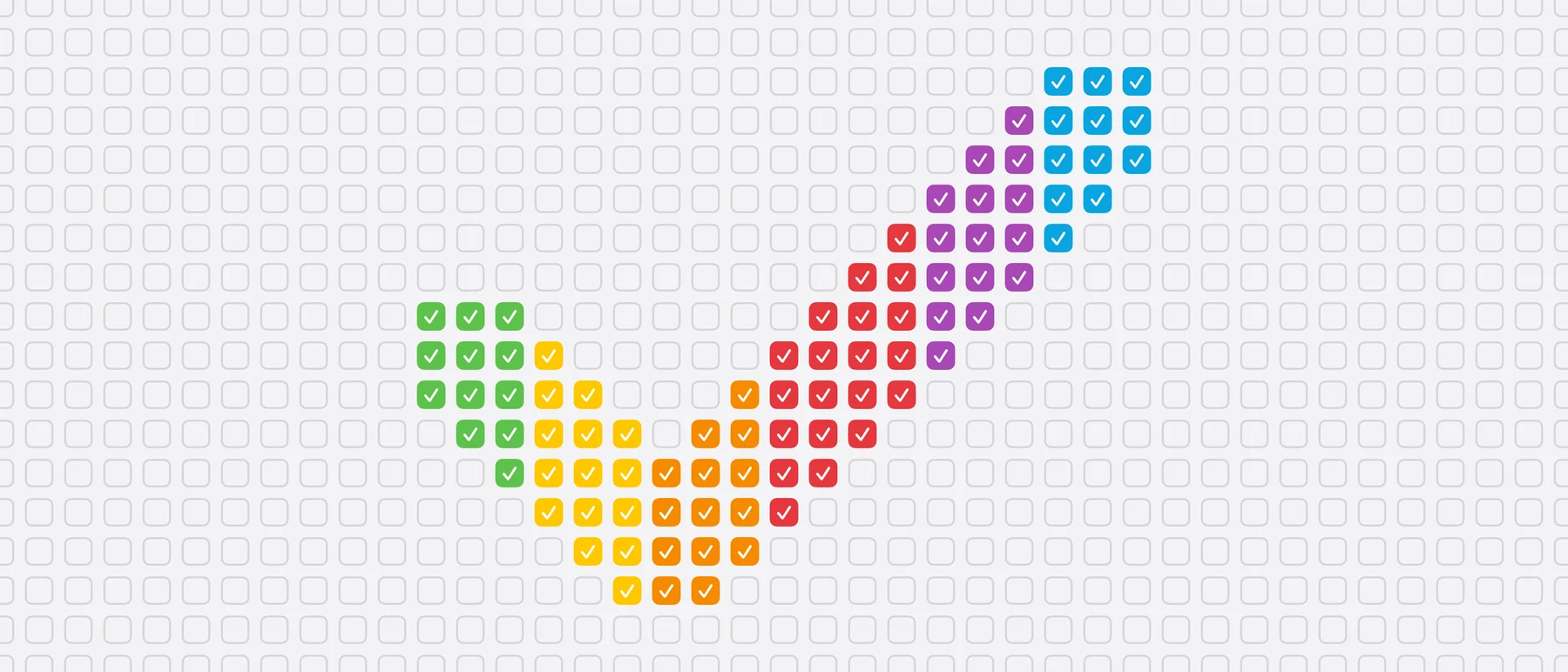
A: one big tick. A wall of empty checkboxes, with a tick in the app icon’s rainbow colours, made by ticking the right boxes. It has no words, so one image works in every language.
B: the finish line. Three lanes of real tasks from the Home and Work projects, with the same people and faces, drift across a blue field. As each card crosses a rainbow line in the middle, its checkbox fills with a little spring, the tick draws itself and a few sparks fly off in the icon’s colours.
It isn’t animated by hand. It’s a web page that draws any moment of the loop, which headless Chrome photographs 60 times a second, and ffmpeg turns the frames into a video. A few details make it work:
- It loops without a seam. Every lane does exactly one lap per loop, and the soft background glows complete whole circles, so the last frame leads straight into the first. A script measures the difference between those two frames to prove it.
- Each language gets its own length. Translated titles make cards wider, and wider cards would have to move faster to finish their lap. So each language picks the shortest loop, starting at 14 seconds in half-second steps, that keeps every lane under a speed limit. If that isn’t enough, it drops a card from a lane. English loops in 14.5 seconds and Japanese in 15.
- The first frame is the poster. It’s the still people see before the video plays, so the lanes are timed to stop there with no card cut in half by the line.
- Arabic runs the other way. The checkbox is on each card’s right edge and the lanes drift leftwards.
That’s 18 videos, each rendered in a couple of minutes by two Chrome windows working on half the frames each.
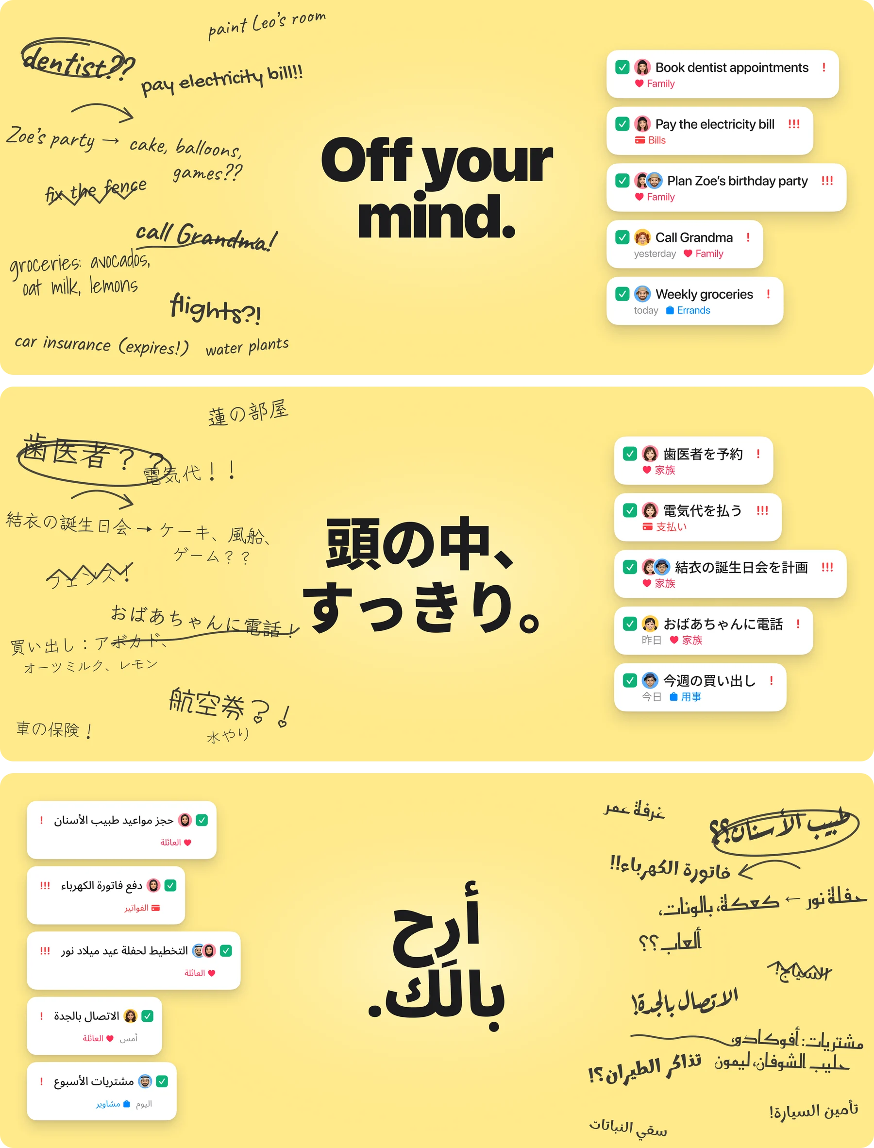
C: off your mind. The family’s to-do list as it lives in your head, scribbled and crossed out (dentist??, Zoe’s party → cake, balloons, games??), next to the same jobs as tidy, ticked Tasks cards. In Japanese the scribbles are about Yui’s party and Ren’s room. In Arabic the whole header mirrors, and the party is Noor’s.
What we’d tell another indie developer
Most of the work above wasn’t done by hand. AI coding agents ran the build, the simulators, the uploads and plenty of the Figma work. The care was in looking at every result and saying what was wrong with it: a name that didn’t feel local, a top task with no priority, a badge slightly off centre. If you’re making your own, here’s what we’d keep:
- Seed your demo data in code, with dates relative to today and IDs that never change. Then a UI change costs one rerun, not an afternoon.
- Localize the people, not just the words. Names, faces, emails and streets tell readers the app was made for them before they read a single headline.
- Only show what the app really does. If the parser doesn’t understand it in Korean, don’t type it in Korean.
- Make it repeatable. UI tests for capturing, one design file for layout, scripts for uploading.
- When something can’t be done honestly, leave it out. No translated reviews and no years that will date. And when the simulator won’t cooperate, a few minutes by hand.
If you’ve just found Tasks through these screenshots, welcome. The Carters, the Beckers and the Satos are made up, but everything you see them do is in the app. Get Tasks on the App Store.